First Assembly of God's
web site
We suggest that you visit the First Assembly of God's web site and tour around it for a while. Then come back and read the review. Feel free to write us with your comments or criticisms at feedback@hartsem.edu.

*The following web review has been provided by a Hartford Seminary student from the fall 2000 class "Religion and the Internet."
Additionally, this class conducted a church web master survey. You can read the research conclusions in our Report on the Webmaster Survey.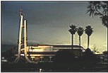
This site’s greatest asset without doubt is its interactive nature. No one could accuse this website of being merely an online brochure. From the first page, you can access a Bible search engine, where you can look up verses based on key words. It includes a drop down box that even allows you to choose between different Bible translations. There is also a chat room, a link to MSNBC local news, a link to see the official weather forecast, a guest book, and a drop down box with different maps showing how to get to the church. Animated buttons that aren’t too large or flashy, but immediately grab your attention, mark some of these features. Information on special events/services appears as scrolling text directly beneath the banner area. The full address, phone number, and church office hours are also prominent on the homepage.
This site definitely has the necessary ‘hooks’ to draw interest from both members and potential visitors alike. It allows a web user to interact with the church in a real way. It offers a broad overview of the programs of the congregation. In that, this site provides many of the features we like to see in a church site.
The site, however, also exemplifies why we do not like nor generally recommend a design that uses frames. The frame layout and design of the pages diminish the power and effectiveness of the church’s online features. Frames split every page into three different windows, each with its own scroll bar. The frame containing the menu system includes a large picture of the church that, while attractive, takes away too much vital space from every page on the site. This photo would be better used on another part of the site. The frames themselves create a cramped feeling, and make it more difficult to navigate. Information or features that should be immediately visible, must instead be accessed by scrolling either down or sideways, sometimes both.
While someone who is already dedicated to this community might put up with this inconvenience, the casual surfer who happens upon this site might not. What they see in those first few seconds as the page loads is very likely going to determine if they want to stay and look further, or simply move on to the next site. A standard, hidden table format would probably serve this site better than frames.
Ideally, the home page should require very little to no scrolling, for either the menu system or the content. Like the cover of a book, the more organized, attractive and appealing it is to the eye, the better it will sell the pages that lie beneath it. For instance, the Tenets of Faith list could be moved onto its own page. The bottom frame could easily be removed all together, and its contents integrated into the banner or other parts of the page. These changes would leave plenty of room to show off the excellent special features at first glance, enticing visitors into taking a further look. It would also allow for more content and white space on subsequent pages. Removing all or most of the frames would eliminate the cramped or crowded feeling of the site. Much as their ministry, the Stockdale Christian School Deaf education program, has done with its site www.christiandeafschool.com.
We also found the photographs to be a great addition to the church’s site, but very few of them included the congregation in action. We found the empty "unfinished" looking photo of the sanctuary to be especially uninviting. Very few elements on the site give a strong sense of the real people that make up the church community, which is what a prospective member is looking to become a part of.
The combination of a warm, friendly, attractive site that has a very personal feel to it, solid content, and interactive features, all work together to entice viewers. This site already has the most difficult of those elements in place; now it only needs a way to touch people on a more personal level, and a style makeover to make it a truly original church website.
|